

Award Winning

Branding
Design
Mental Health
Strategy
Workplace
MATES in Construction
MATES needed a symposia brand strategy that would appeal to two very distinct audiences: mental health researchers and blue collar industries.
With the advent of COVID, the branding strategy expanded into the development of a full digital platform for industry mental health insights and knowledge.
After an extremely successful launch of the platform v1.0, MATES is already looking ahead to future capacity and developments. Stay tuned!
MATES in Construction (MATES) is a charity established in 2008 to reduce the high level of suicide among Australian construction workers.
MATES provides suicide prevention through community development programs on sites, and by supporting workers in need through case management and a 24/7 help line. They serve the construction industry in Queensland, New South Wales, South Australia and Western Australia, the Energy industry in Queensland and New South Wales, and nationally to the Mining industry.
True to the name, the MATES model is generally beloved across the trades industries, largely owing to being designed and run by those who understand the lives of the people they're aiming to help. The program is so successful that the World Health Organisation has even referenced it as an example of suicide prevention best practice. MATES is well known to have helped thousands of Australian tradespeople seek help through on-site crisis connection programs, training, and help lines, and more.
Yet, this success has made it sometimes challenging for MATES to show its other side: a powerhouse of research in suicidology and mental health. Indeed, MATES sometimes straddles two very different identities: the bloke on site who can help connect you to someone when in crisis and the researcher behind a desk capturing important new insights.
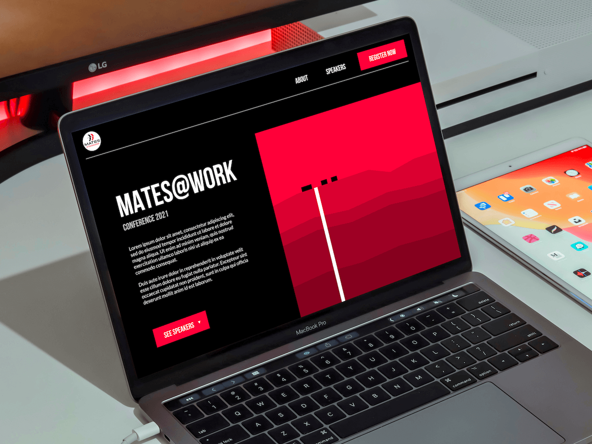
To solve this, MATES Queensland (MIC QLD) hatched a new program idea: a symposia series to bring together researchers and thinkers across the mental health industry, and help catalyse important collaboration and networking for new ideas and approaches. The symposia would be a meeting place for new ideas, shared resources, lessons, and opportunities to improve the wellbeing of workplaces across the country.
Yet, the act of creating an event alone does not guarantee ticket sales. Careful consideration about how the symposia were to be communicated was key. MIC QLD engaged spur: to develop a brand and engagement strategy for the symposia that could speak to both MIC QLD's identities, and find a middle ground between high-vis vest and lab coat.
Little did either MIC QLD or spur know: how this project would change by the end of it...
MATES has a long and established brand identity in the market. While the symposia called for something new, it was also important to leverage the trust and recognition of existing brand. Instead, the approach to the brand was like a modern extension to an established house. It also needed to work across many elements for the conference in different format, media, and contexts.
Research is always a critical component to brand development and it included analaysis and reflection on existing MATES branding, behaviour change theories, market scan including events, public transport guides, construction itself, and patterns in industry environments.
Palette
MATES' existing colour palette consists of three primary colours: black, white, and red. The conference branding simply extended this palette with additional shadings, to provide a little more flexibility and nuance.

Fonts
MATES traditionally utilises two core fonts: Trade Gothic, and Robots.
Tade Gothic is typically used by MATES for headlines and captions. It is a paid font which is fine for in-house-use, however, for a conference where partners and exhibitors may need to utilise or tap into MATES branding, a paid font can end up being tricky. We adopted Bebas Neue, a similar but open-source block font. Bebas is also a slightly narrower font—making it ideal for advertising with less space taken up.
Roboto is MATES' standard paragraph font. Roboto is a popular and robust font that it is open-source. However, its popularity can lead to it feeling a little generic and the nature of the conference allowed for a slightly more refined font. Therefore, Epilogue was adopted —a similar font, though slightly rounder to offset the hard edges of Bebas Neue.

Feel and style
The established MATES branding is deliberately masculine-feeling — often using squares, strong contrasts, block layouts, and other hard edges. This aligns with existing tropes and stereotypes of the construction industry and other blue collar trades. However as the project was to bring lots of different voices and perspectives together, this branding may alienate other MIC QLD stakeholders such as mental health professionals, academics, and other researchers.
spur: took a rather literal approach to bringing these disparate worlds together by combining two elements:
spur: wanted to collide MATES's strong graphic lines with a heightened sense of sophistication and intelligence. The result was a graphic and minimal take on these elements brought together. As below where a data graph combines with a tableau of a construction site:
Or, data graphs and mine sites:
The marrying of strong graphics and minimalism lends itself to engaging and striking media and comms. Throughout the brand, we utilised alternating blocks and thick lines of colours, that not only look striking but may emulate some of natures attention-grabbing effects.

COVID
During the development of the branding strategy, there had been murmurs of capturing content from the symposia in a digital repository—not just for posterity, but to ensure that knowlege could be shared as far and wide as possible.
COVID—the great disruptor—amplified those conversations.
Despite some clear moments in Australia's COVID numbers, sporadic breakouts and associated lockdowns across the country heavily impacted the ability for people to travel—including to MATES' intended conference. It seemed in-person symposia were off the table.
What happens when life gives you lemons? You build a digital platform.
MIC QLD quickly pivoted the conversation to how they might move all of their plans for the symposia into a digital repository.
The extended brief was simple: to design and deploy a site that was minimal, functional, and allowed MIC QLD to test whether a digital repository resonated with stakeholders.
Wellsaid
The platform, obviously, required a name. spur: suggested "Wellsaid".
Wellsaid is a play on words between the content being presented well, as well as to embed the primary function of the site which is to help workplaces support and improve staff mental wellbeing. A simple logo that capitalised on existing design was developed:

The platform
MIC QLD wanted to ensure that presentations (videos or talks) were the primary focus—in one discussion MIC QLD quoted: "We don't need bells and whistles at this stage—we just need something that works". However, some additional functionality such as a repository of tools and latest Wellsaid news was considered important for v1.0 of the site.
Inspired by the simplicity of similar sites such as TED or streaming services like Netflix, spur: designed, developed and deployed wellsaid.mates.org.au. Wellsaid is a site that is minimal, functional, biases towards immersive imagery, and allows the content to speak for itself.
As Wellsaid prepared for launch, MIC QLD readied dozens of knowledge-laden videos, talks, and resources. When Wellsaid finally went to publish, it was already offering hours of education to help build healthier and safer workplaces.

.jpg)
Lee Crockford
He / Him
.jpg)
William Smith-Stubbs
He / Him
.jpg)
Urusaro (Trisha) Rwagaju
She / Her


